Card blocks used to display multiple items with/without a link button
Mandatory fields that have to be filled in are marked with an asterisk *.
If there is no asterisk it means the field is optional.
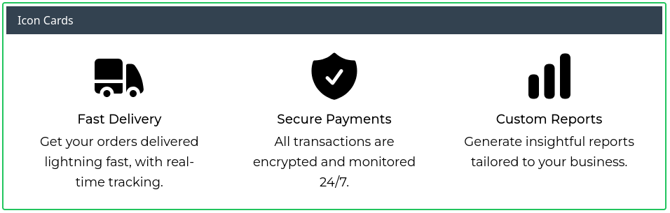
Icon cards
Number of columns*: Select the number of columns you want your icon cards to spread across
Title*: Enter the header for the icon card section
Description*: Enter a description of the header
Icon: Select an icon for that section
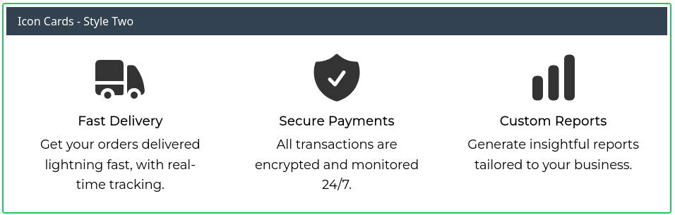
Icon cards - Style two
Same as the first icon cards block but with a different style
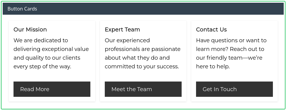
Button cards
Title*: Enter the header for that button card section
Body*: Enter a description for that section
Button Text: Enter the text you would like displayed on the button
Button URL: Enter the link you would to be opened when the button is clicked
Link cards
Same as the button cards block but with no graphic